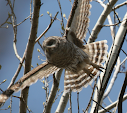
- Simplify the subject, crop tightly
- Eliminate background clutter
- Utilize the 'rule of thirds' to place focal points
- Balance tonal or physical elements
- Spacing around the subject and enough room in frame for a moving subject to continue
- Avoiding mergers
- Leading lines
Of course when shooting spontaneously while hiking there is a lot of making do with what was captured, so often many of the above aren't applied. The assignment for this week is to present three photos, one that displays 4 'rules', one that breaks four rules, and one that shows two while breaking two others.
Looking at the image above I would critique it with the following, the subjects while simple are lost in a lot of empty space. Neither is anchored within the frame. There is nothing to draw the eye towards the ducks, or to cycle back between them. A slight leading line follows the wake of the ducks, but it is not on a diagonal and leaves the eye 'restless' looking ahead of the lead duck.

Here a tighter crop on the same image gives it a bit more strength. The subject is now larger in frame, and has more definition. Using the rule of thirds the Ring-necked Duck is anchored in the lower right intersection - a place that the eye is naturally drawn to. The bird has room to swim into the frame, with enough of the open, grey water to convey the atmosphere at the time of shooting. Obviously there is still nothing to balance the duck in the upper-left, but with the tighter crop the open space is less distracting. The high ISO required for the dark day makes noise an even greater annoyance on any tighter crop, so going tighter on the duck doesn't make sense.
Just a few thoughts on what goes into how an image is cropped when I am doing the chopping. They wont make a dull image like this into anything spectacular, but hopefully putting a bit of thought into what gets posted helps to make the final images more appealing. As I will be contemplating this and other aesthetic concepts in the next few weeks please feel free to offer insight - I am always looking to improve.


No comments:
Post a Comment